|
I lost my artist name but he used more of a scratchy style of painting. I used that idea in the background of the peice. I also made the skin tone color more grayish than tan. I didn't do very well on the face but the jacket was very neat and well executed. The most difficult part was the lips and eyes. It was to small of a part and I didn't have the right brushes to do it. I chose black grey white and brown for the background because that's what my artist did. The style was more raggedy than perfection. I wasn't trying to make it look perfect. I don't think my artist would of liked my picture. It reflected bad on his paintings. I would of made my canvas bigger so I didn't have to worry about the small spaces 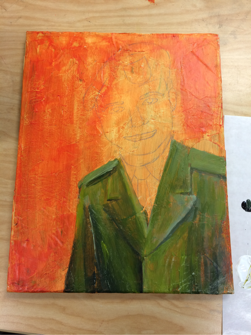 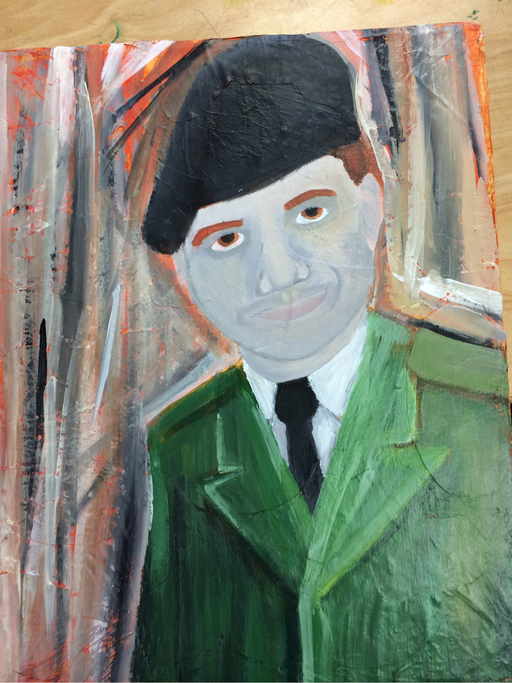
0 Comments
My sculpture was well sculpted. The most difficult part of this project was the inside sculpting on the ice cream. My sculpture is interesting from the front but not the back. When drawing 2D you have to worry about the shading and things but when creating a sculpture, you have to make sure it looks real all the way around. I created texture by putting m&m's and making the ice cream wavy inside the cup. My sculpture did not look like the food because I didn't paint it. I wouldn't of done this project again. I hate sculpting 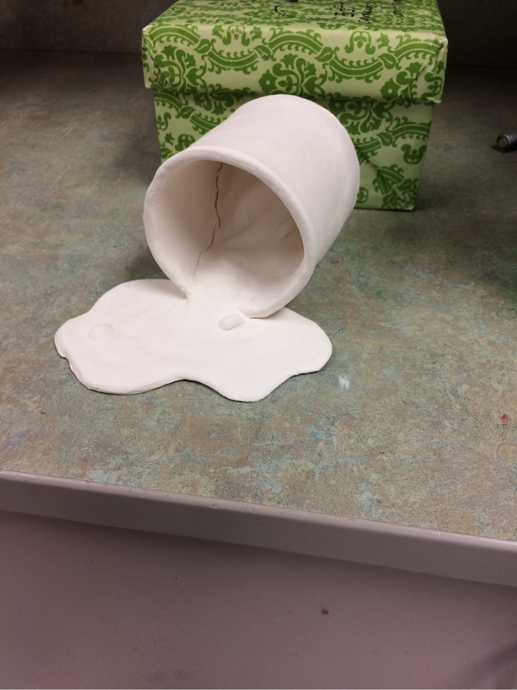 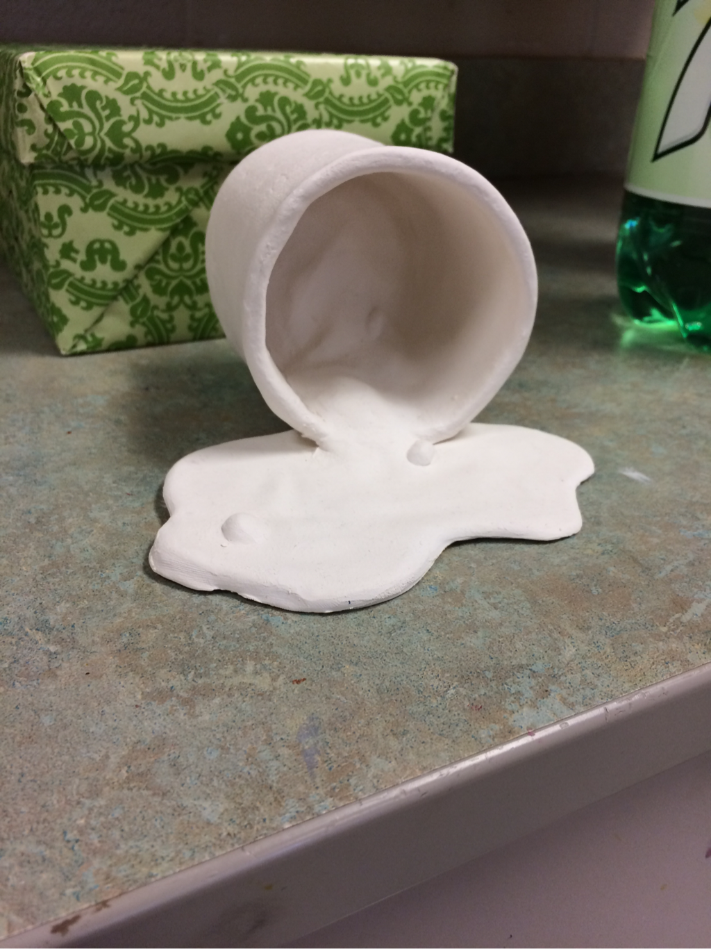 stamp making was a very fun activity . My two choices were the Brooklyn bridge and the Northern lights. I chose the Brooklyn bridge because it looked the coolest. I started of by coloring a sketch of the picture. This helped me visually understand where I would place the colors on the stamp. Then I traced the picture with tracing paper and transferred the led onto the stamp. After that I labeled where each color would go. I started with the lightest color and worked my way down to the darkest. The people at my table helped me figure out when to put each color down. This project was very difficult. Making sure that the paper was lined up with the stamp was the hardest part. I messed up on a lot of them but I still like the way it turned out. The clouds were my favorite part to carve out. I was able to accomplish the way I wanted it to look through help with my classmates and being focused to get it done. 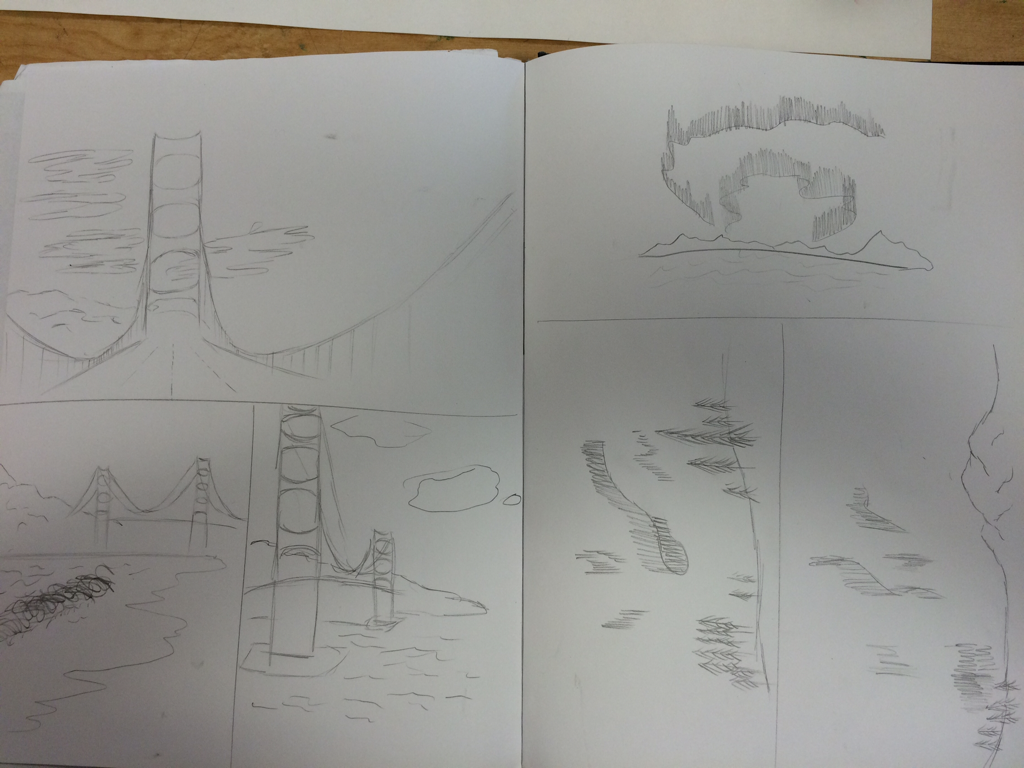 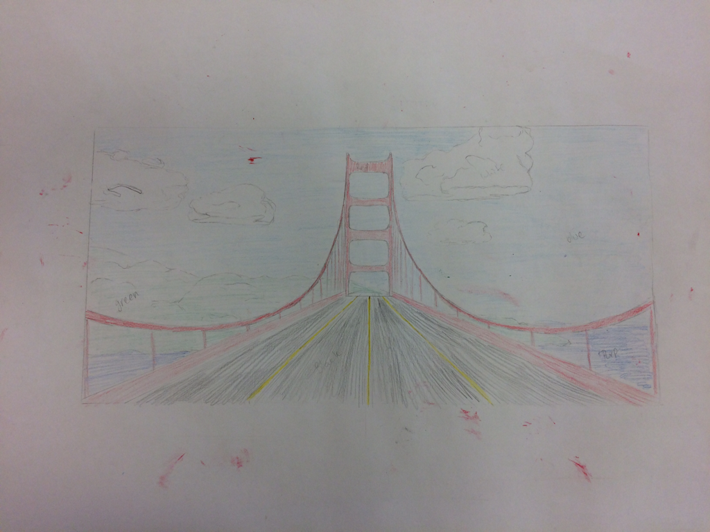 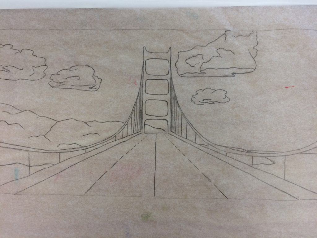 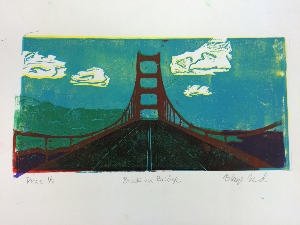 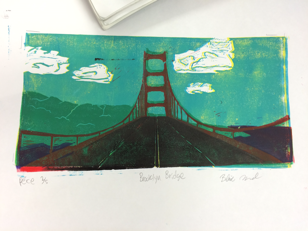 the apples were a lot of fun to create. The different colors like cool and hot. Then with the Gatorade bottle I made the light blues and dark blues to add value. 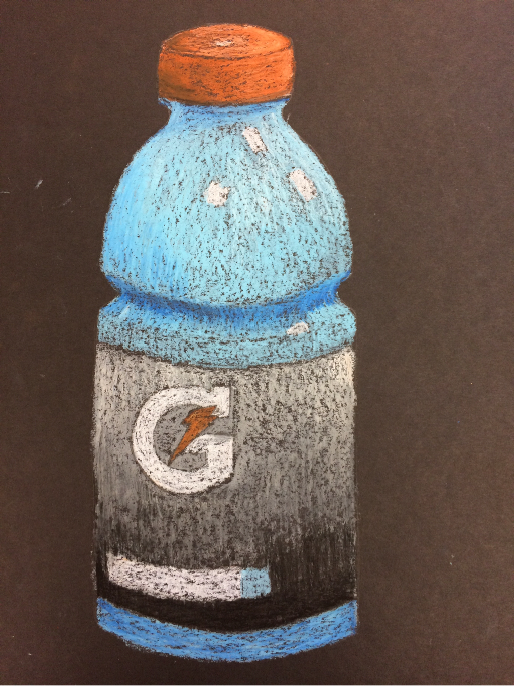 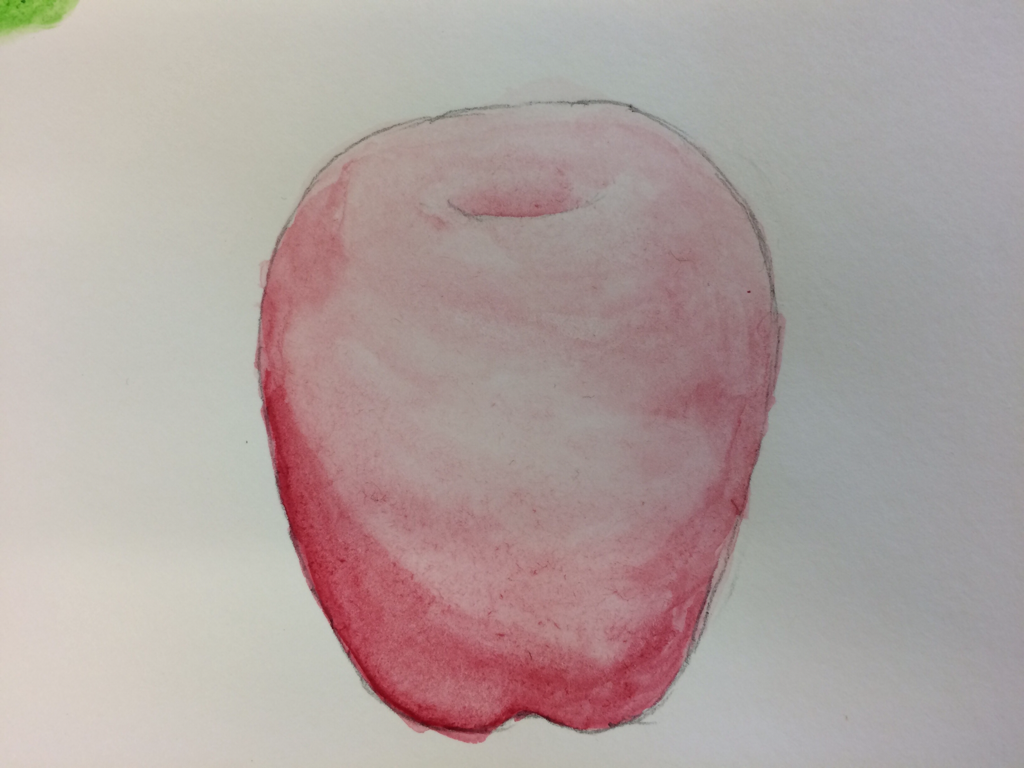 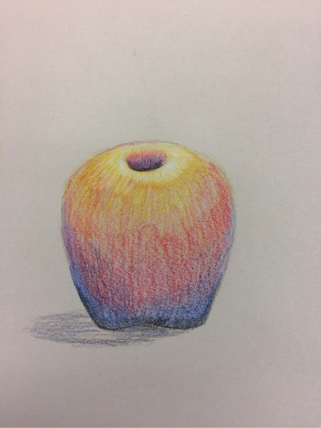 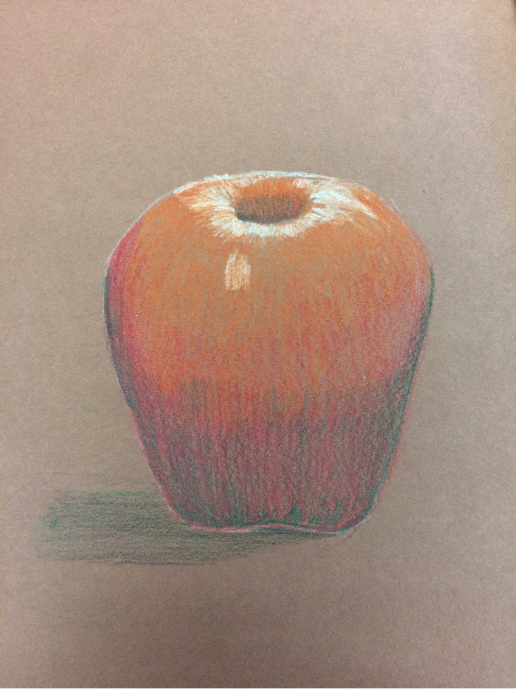 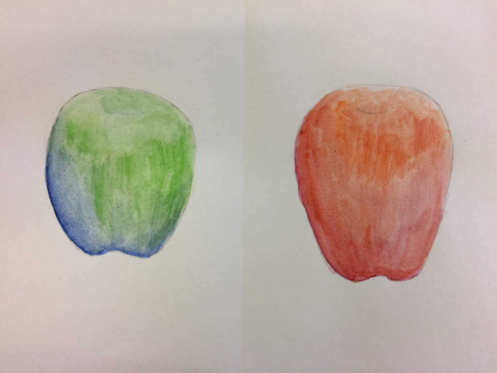 starting the marbles I was very undecided if this is what I wanted to do. I thought it was going to be extremely hard. I started off by doing two sketches of two different marbles. Making these sketches helped me develope ways of making it look glassy or clear. I drew the circles with the my pinkie on the paper while spinning the pencil. Then I added the outline of the design in the marble. Then I went in with prismsa color. I think the colors gave it a unique look. I put shading through the colors and then mixed the colors with my finger. Then I put white and black thought the edges to develop the glass look. I would of changed the designs and put more detail into each marble. I like the big marble but not the other ones. 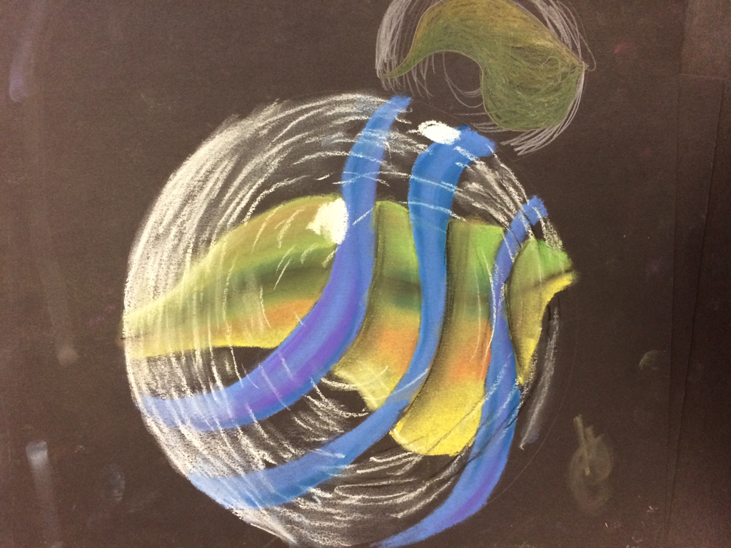 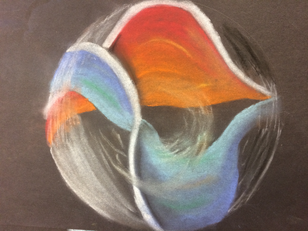 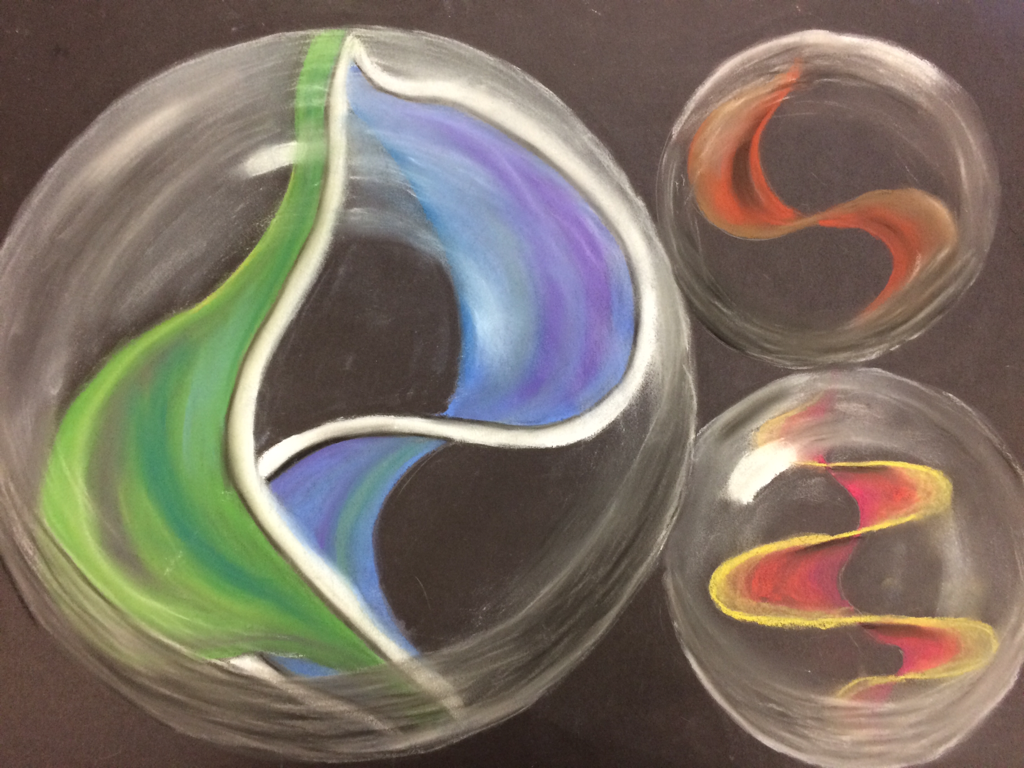 Playing cards is one of my many hobbies. I thought it would be cool to make the chips repeating throughout the drawing. I started with the hand and cards and developed value through shading. I put shading on the chips and the table. I also made the chips uneven to make it more realistic. I think pencil was the right choice in media, maybe pen would have be more successful. I had a vanishing point and I had the cards and table point towards it. I could of put more detail in the table. I could of also put different drinks and food on the table. I liked how the finished piece came out. I thought I was successful in creating my image. 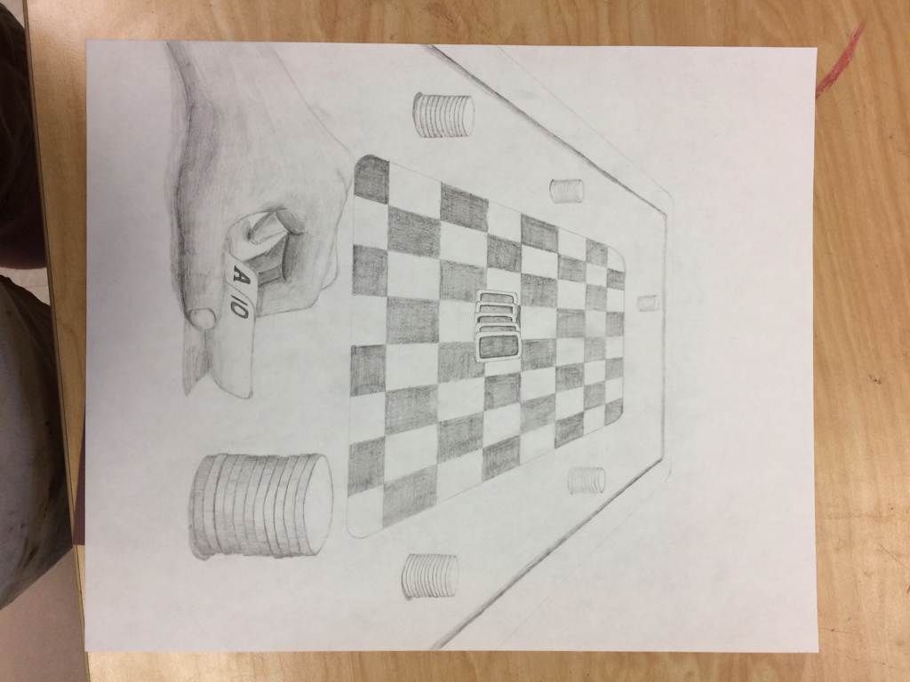 |
AuthorWrite something about yourself. No need to be fancy, just an overview. ArchivesCategories |
 RSS Feed
